
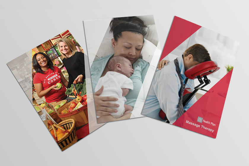
Two page (bi-fold) brochures to promote each service.
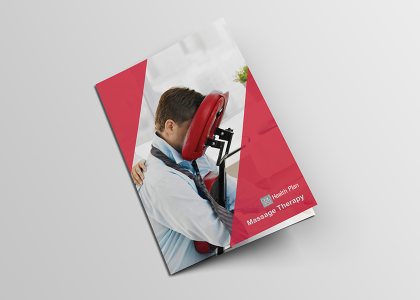
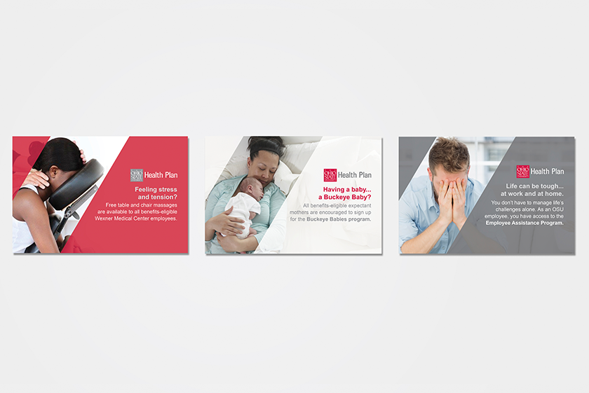
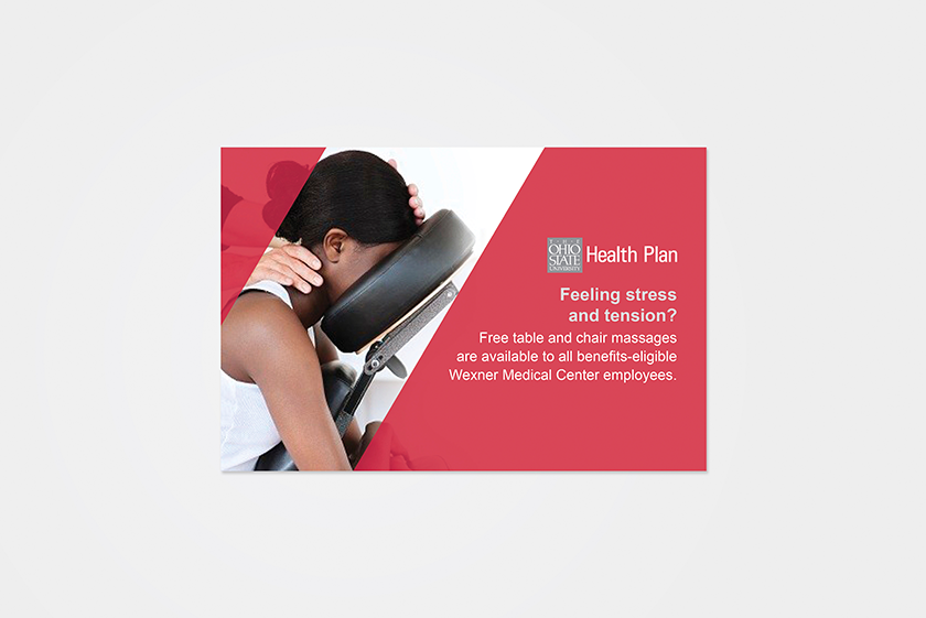
The Bi-Fold Brochure to promote their Massage Therapy service that offers University departments complimentary, on-site chair (and table by request) massages for staff.

Massage Therapy Brochure (Front & Back Covers)
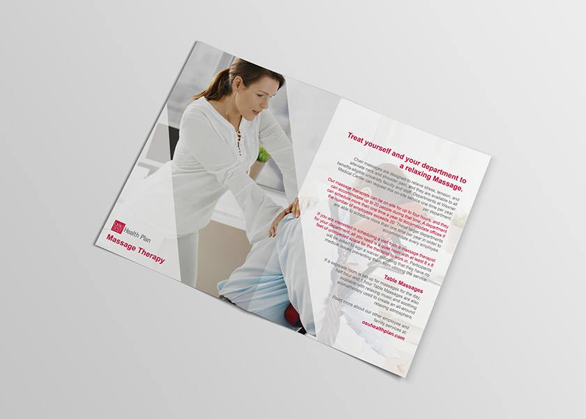
Massage Therapy Brochure (Inside pages)

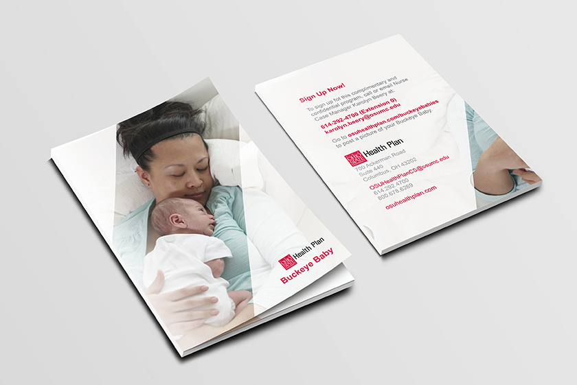
The Bi-Fold Brochure to promote their Buckeye Baby Program that offers free support to expectant moms from early pregnancy through delivery and post-partum.

Buckeye Baby Brochure (Front & Back Covers)
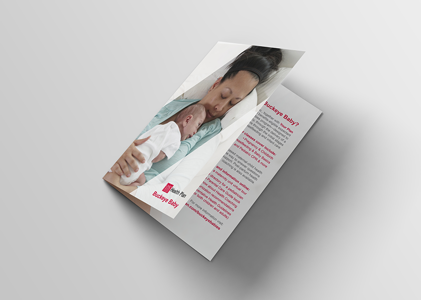
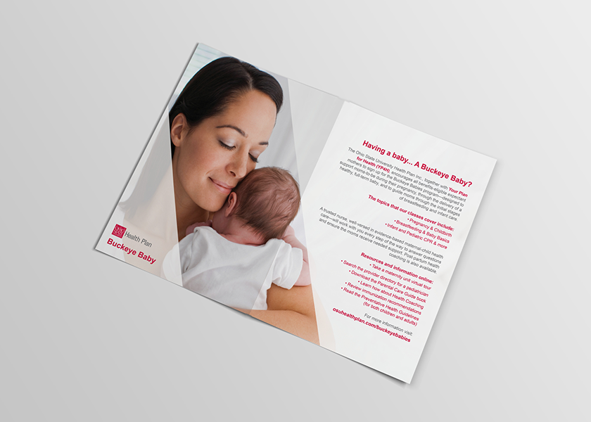
Buckeye Baby Brochure (Inside pages)

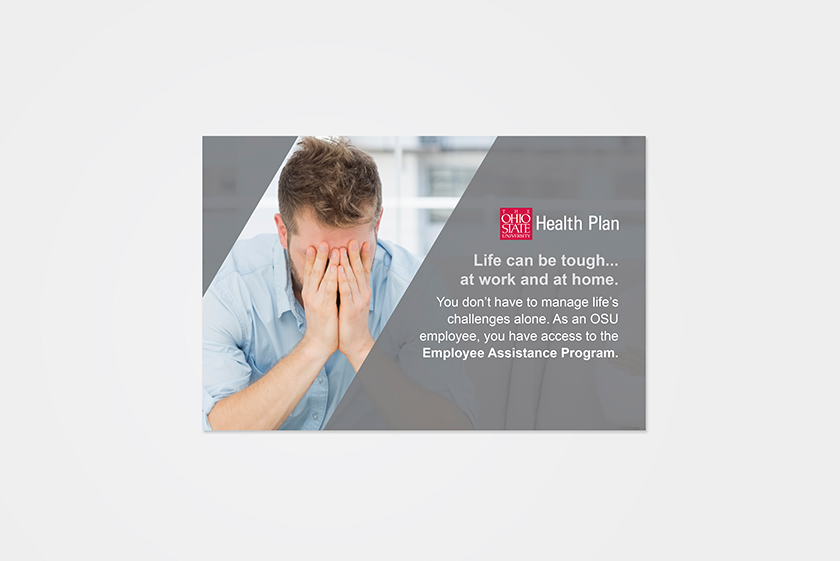
The Bi-Fold Brochure to promote their Employee Assistance Program that offers complimentary services and tools to help get employees through the rough spots in their lives.

The Bi-Fold Brochure to promote their Personal Health Coaching that offers employees access to free health coaches to develop an action plan and strategies personalized for their specific health needs.
I also created accompanying folders for each service that can contain all of the department's promotional materials.The folders are thick, high-quality materials that insure the preservation of the contained information.
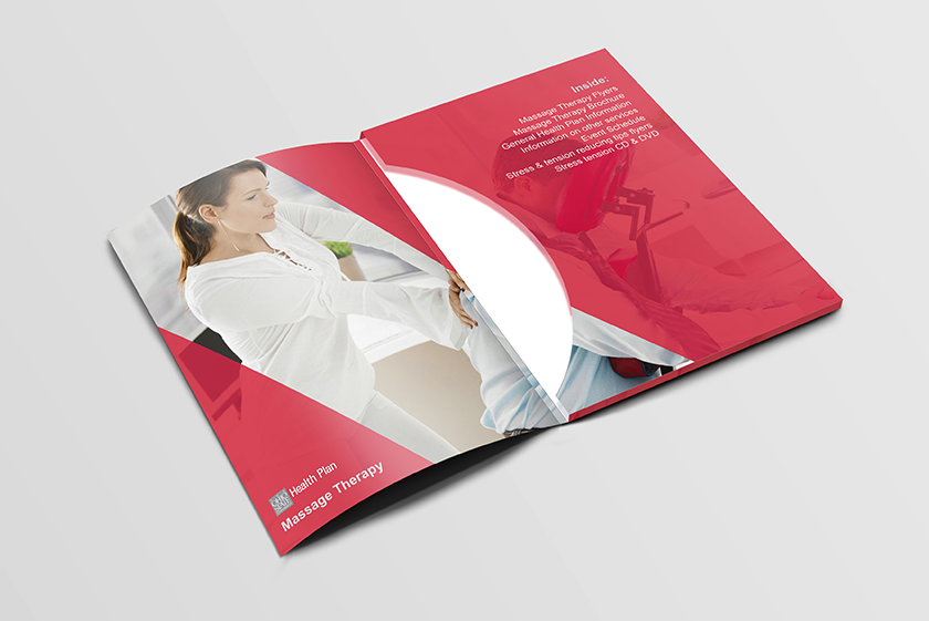
Massage Therapy Folder (Inside)

Employee Assistance Program Folder (Inside)
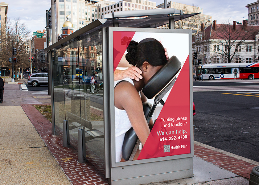
Massage Therapy Bus Stop Advertisement.
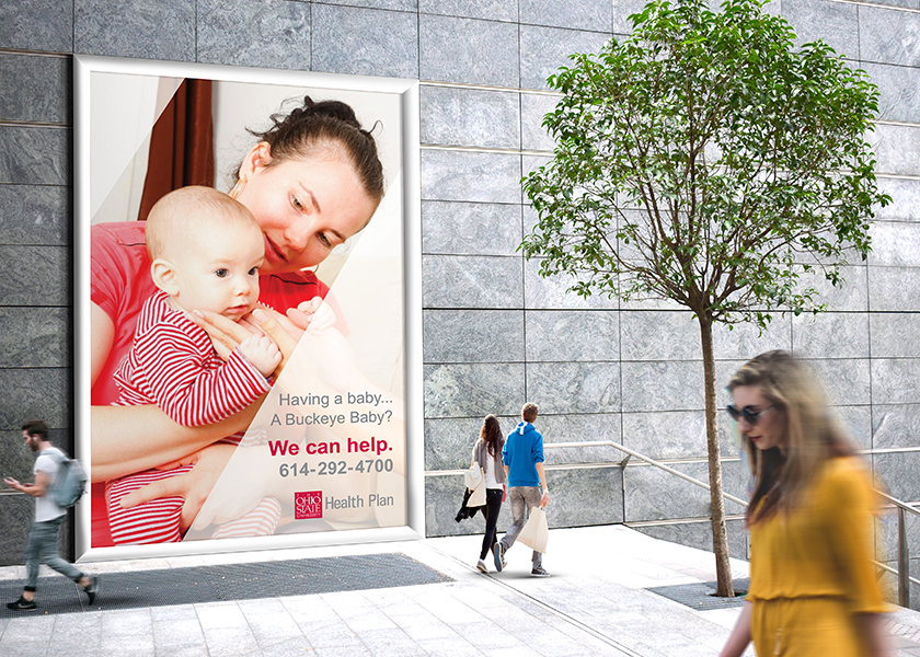
Buckeye Baby Hospital Outdoor Advertisement
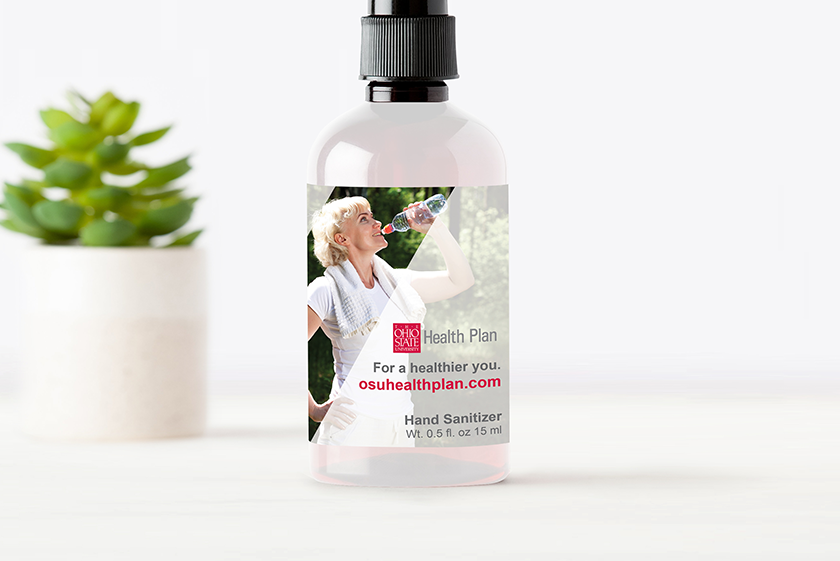
Label for the complimentary hand sanitizer bottles given out at events and other Health Plan functions. They are also offered at departments throughout the campus.
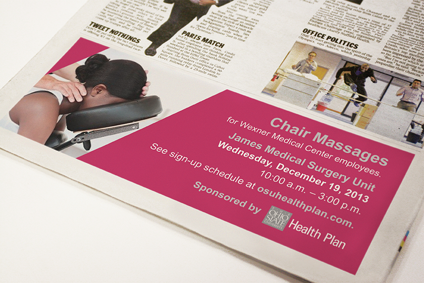
Massage Therapy Newspaper Advertisement
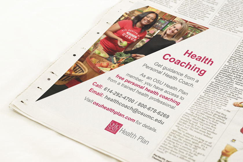
Health Coaching Newspaper Advertisement

Mailing postcards to promote their services.

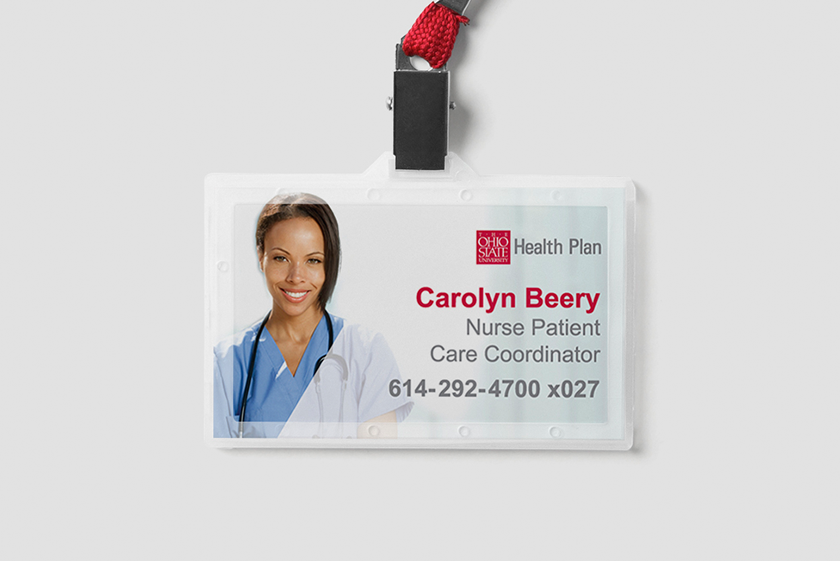
Buckeye Baby Nurse Specialists & Coordinators ID Badge.
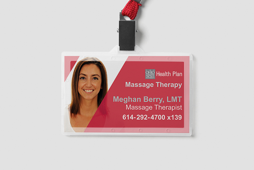
Massage Therapy Department member ID Badge.